10 Things That Make a Website Look and Feel Modern
The Top 10 Things You can Do To Give Your Website a "Modern" Look
It’s no secret that websites that look more modern have a higher conversion rate. Sort of like birds who grow beautiful plumage during mating season, it’s a way to show potential customers you’re serious about the work you do. If you’ve invested in your company’s digital presence, you’ll attract clients looking for a reliable, honest company.
So, what makes a website
modern?
We’ve broken down the top ten things that immediately give a fresh feel to a site:
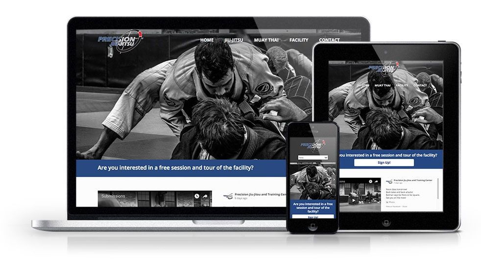
1. A RESPONSIVE LAYOUT FOR DESKTOP, TABLET, AND MOBILE DEVICES.
More than half of site traffic comes from mobile devices, so it is crucial to have a website that looks great on both desktop computers and mobile devices. Websites are not built to handle scaling down by default and this design aspect must intentionally be incorporated into the development of a website.New Paragraph
2. Full-width layouts.
The standard was once to have a restricted width layout on a white or single color background, as if you were looking at a magazine with a table or desk as a backdrop. Today the aesthetic is moreso to have a site that spans the width of the device viewport.
3. Animations!
Animations can truly make a website pop off the screen and capture a visitor’s attention. It can be that one little factor that makes your website stand out. Animations were once code-intensive and therefore potentially had slow loading times, but many of them can be carried out with very little code in CSS and JavaScript.
4. Minimize the number of fonts.
No more than three fonts max is the key to making the site look modern and maintaining a unity of design.
5. Maintain the look and feel of the website across browsers.
Different browsers have default stylings that can overwrite the website’s defaults. Maintaining the look of your website is easy with some circumspect planning from the developer.
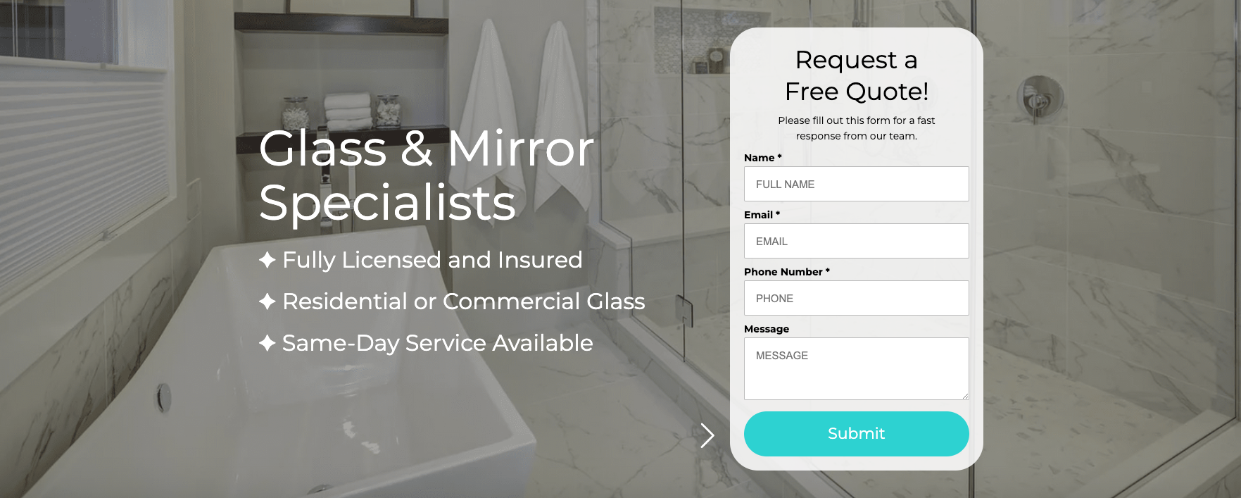
6. Include Call to Action buttons.
No one wants to look for your phone number and manually dial it in, right? They just want to see a call to action to click a button and connect. Call to action buttons provide a way for visitors to quickly make the conversions you need and intend to provide via the website. These are an absolute must.
7. USE ORGANIC SHAPES.
Gone are the days of every single element of a webpage as a rectangle or a square. Contemporary sites are integrating more and more polygons, waves, and amorphous elements.
8. MAKE USE OF COLOR GRADIENTS.
Not really a new thing - gradients have been prime for awhile now in the world of front end design and development, but they show no sign of going away anytime soon. If you truly want to make your site look contemporary, consider integrating gradients into your website and/or logo.
9. GRIDS.
Inherited from graphic design, breaking down the design of a site into a grid is also an essential step in web design; however, it can also be interesting to play with this core element of graphic design, making the grid an exposed part of the website or even breaking the grid.
10. INTUITIVE NAVIGATION.
The rule of a great interface is “don’t make me think”. Sitemaps and navigation should be easy to follow and get you exactly where you want to be without any surprises (unless it’s fun and relevant).
Ready to see what your site would look like with these modern design elements?
You're in the right place.
Reach out to our web design team and let us know what you're looking for: your goals, your concerns, things you like that your competitors are doing, etc. Learn more about our
website design services and let us know how we can help!


