
Why Your Contact Form Isn’t Converting
You’ve spent countless hours and thousands of dollars making your website look pretty. At this point, your website should be a well-oiled machine that brings you business. The contact form is the number-one tool for getting you the information you need to conduct a successful sale. If your contact form isn’t simple and easy to fill out, don’t expect your visitors to waste their time providing you this information.
Less Fields = More Leads
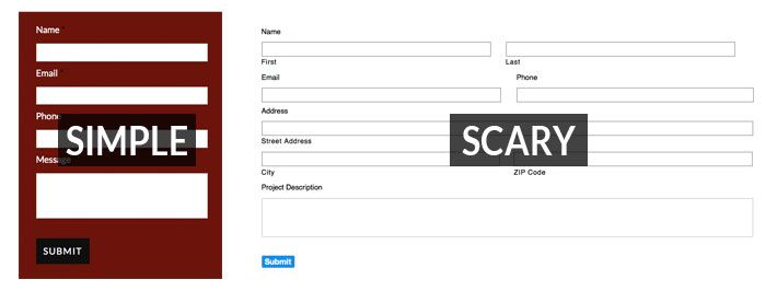
Every field you add to your contact form adds another layer of complexity. Sure, I’m always curious to know which service my customer is interested in and how they arrived at my site – but do you really need to know these miniscule bits of information? Will they really help you close the deal? In most cases, the answer is no. You can easily find out this information later, after your customer has filled out your simpler contact form.
Make Phone Numbers Optional
The phone number is the nugget of gold within a completed contact form submission, offering you the opportunity to position yourself directly in front of a potential buyer. In fact, many websites require this field be filled out. Unfortunately, a lot of business owners are wary and suspicious of giving away their phone numbers, and with the overwhelming amount of spam and solicitation these days, who can blame them? They also fear the scenario of being called at their inconvenience in the middle of a busy workday. Avoid being overly demanding; if people want you to call them, they will give you their number. Don’t miss out on a potential conversion because you’re asking for too much.
Keep Things Simple And User Friendly
Avoid splitting your fields into multiple columns. Doing so will remind visitors of those overly lengthy medical forms that scare people half to death (or scare me at least). If they fail to fill out the form correctly, make sure they are given clear prompts indicating what they did wrong. And finally, thank them for filling out your form and let them know what the next step is.
Avoid Captchas At All Costs (Well, Sort Of)
Spam is a growing abomination that plagues the internet. It’s a well-known fact that captchas prevent robots from filling out forms on your website.
Yet one of the quickest and most surefire ways to harm your conversion rate is to require visitors to fill out a captcha. We’ve all filled out a captcha before, and I’m sure most of us have had a bad experience or two. These experiences left us with a sour taste in our mouths. Drop the captcha. You would be better off holding a large sign next to your contact form that says, “This is going to suck.”
But wait, there’s hope! Google Recaptcha protects against spam while providing an effortless experience for your visitors. You’ll notice this tool is growing in popularity as more and more websites install it. Consider making this your spam defender today. Learn more about Google Recaptcha here.

Don’t Use ‘Submit’
I know I talked about keeping things simple. What’s more simple than ‘Submit’, right? Unfortunately, the word ‘submit’ is one of the least successful labels for a contact form button. ‘Click Here’ and ‘Go’ are actually a lot more successful for conversion. I personally prefer action and descriptive words over ‘Click Here’ as it’s overly marketing-oriented. It also shows a lack of respect for your visitor’s intelligence, assuming they don’t know how buttons work. Consider using a label that describes the functionality of the button such as ‘Sign Up Here’ or ‘Schedule Appointment’.
Respect Their Privacy
Visitors may second guess the intentions of your form. Have a short privacy policy that states you will not sell or distribute the information you collect. Without a privacy policy, visitors could assume the worst.
Summary
Following the guidelines above will raise your contact form’s conversion rate. It will also keep website visitors happy by providing them with an easy, stress-free experience. Everyone’s audience is different. Experiment by testing different scenarios and fine-tuning your form until it’s the perfect fit.
The post Why Your Contact Form Isn’t Converting appeared first on GetPhound.